The colours around us affect our perception more than we realise. They impact how we interact with one another and the world. Paint colours have a unique psychological impact that can evoke various feelings and behaviours. Some colours are known to energise, some to soothe, while others to distract. Here are some of the most popular colours and how they affect your workplace.
Blue
Blue is a very popular colour for workspaces. It generally makes people calmer. It also helps to achieve a balanced atmosphere, helping employees stay focused. Colour Psychology states, “It has been proven that different shades of blue can stimulate thinking, improve concentration, and provide mental clarity. It also improves productivity, making it a great colour to surround yourself with when working.” But, if you overdo it, you could create an opposite effect. You can add fragments of blue into rooms where you want your employees to be more productive.
Red
It may seem counterintuitive to paint your office red, but using the shade correctly can energise the employees. Red is said to add energy to the room and get the heart pumping faster. Red is also the colour of aggressiveness and anger. If you paint your workspace entirely red, you can get the heart pumping faster, and it could have a negative effect. But cautiously highlighting some parts with red could be beneficial.
Green
Green produces a calming effect, just like blue. It is alleviating as well. Green can make you feel more comfortable while working. If your employees have stressful jobs or work long hours, you can help them by adding greener to the surroundings.
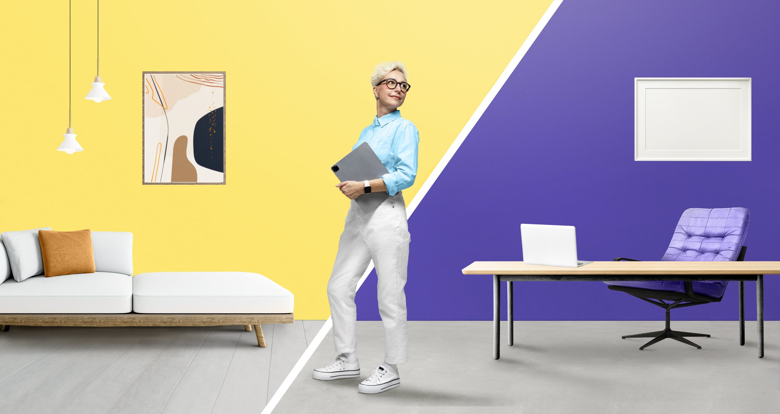
Yellow
If you want to inspire creativity, choose yellow. This colour is also linked to positive emotions like excitement, happiness, and optimism. Yellow can help inspire employees in creative fields to develop innovative new ideas.
Orange
Orange spreads cheerful, friendly, and youthful feelings. It stimulates the power of communication. This shade can keep employees happy and positive about their work life, encouraging productive discussion.
Purple
Purple stands for luxury, ambition, power, dignity, wisdom, independence, spirituality, vitality, mystery, and magic. It has the power to calm the mind and nerves and uplift spirits.
The good thing about purple is that it has several hues that are great choices for the workplace, including lavender, plum, mauve, and periwinkle. You can use these shades of purple to reduce stress and anxiety in your workspaces.
Black
Black is associated with power, elegance, formality, seriousness and professionalism. It can evoke deep emotions, but too much of it is overwhelming. Black also has a negative connotation and produces feelings of fear of the unknown. You can use it to add a sense of formality to your office, but cautiously.
White
White is often perceived as clean, modern and fresh. It can look attractive when used with other pops of colour. White can create balance to brighten the office. You can incorporate it with other colours to keep your office inspiring.
Last words
Workplace colour psychology can impact how they feel and how well your employees work. Getting these components right is crucial to bring business success. When applying office colour psychology, you need to think strategically. If you find any complications, you can consult with professional commercial painters in Sydney from Priority One Coatings.