
House Paint Colour Trends 2026: For Australian Homes
July 10, 2026
Colour is one of the most powerful and timeless tools we have to express personality, set the mood, and completely transform the feel of any living space. Yet repainting with the same shade year after year can quietly drain the life from a home. So when the moment arrives to refresh your property, the question every homeowner asks is: what are the painting colour trends for 2026?
Whether you are planning an interior refresh or a full exterior makeover, keeping pace with the year’s most relevant colour palettes is one of the smartest investments you can make. 2026 has arrived with a bold and beautifully cohesive aesthetic: warm, grounded, nature-inspired hues are at the fore, and the cool, sterile greys and icy whites that dominated the last decade are firmly stepping aside.
At Priority One Coatings, we stay ahead of these shifts so that every project we deliver looks current, confident, and crafted to last. In this article, we walk you through the most exciting exterior and interior colour trends shaping 2026, along with the key considerations to keep in mind before you pick up a brush.
Top Trending Colours for a Full House Makeover
After years of minimalism and cool-toned palettes, 2026’s colour story is distinctly warmer and more personal. The palette for this year spans earthy neutrals, botanical greens, moody darks, and sophisticated deep tones — a rich range that suits every architectural style and lifestyle. So, before hiring house painters in Sydney, let’s look at the standout choices for both exterior and interior painting.
2026’s Ideal Exterior Colour Scheme
Warm Neutrals & Greige: The New Grey
The cool, blue-toned greys that dominated the past decade are on their way out. In 2026, the statement move is towards warmer, more nuanced neutrals — specifically, greige (a sophisticated blend of grey and beige), mushroom taupe, sandy khaki, and creamy off-whites that feel far more welcoming and organic.
Sherwin-Williams named Universal Khaki (SW 6150) its 2026 Colour of the Year — and it is easy to see why. This true khaki sits perfectly between warm and neutral, complementing natural materials like stone, timber, and landscaping beautifully. Other standout options in this category include Sherwin-Williams Alabaster (SW 7008), a creamy, muted warm white, and Dutch Boy’s Melodious Ivory, a soft, warm cream that brings a gentle glow to any facade. If your home currently wears a stiff steel grey, a shift to greige or warm taupe will make it feel instantly more inviting and on trend.
Nature-Inspired Greens: The ‘It’ Colour Family
Sage green, muted olive, forest green, and earthy moss tones are unquestionably the star performers of 2026’s exterior palette. These nature-inspired hues create a calm, grounded connection between the home and its natural surroundings — a design principle known as biophilic design.
For homes surrounded by gardens or trees, options like Sherwin-Williams Evergreen Fog (SW 9130) — a deeply muted green-grey — or Sea Salt (SW 6204), a softened, sophisticated green with blue undertones, deliver effortless elegance. Valspar’s 2026 Colour of the Year, Warm Eucalyptus, captures that same earthy grey-green beautifully for Australian homes. Whether used as a full body colour or in combination with warm timber accents and stone details, the greens of 2026 elevate a home’s kerb appeal like no other family of colours.
Moody Darks & Dramatic Statement Finishes
Bold homeowners are being rewarded in 2026. Deep, dramatic hues — think dark charcoals, rich chocolates, smoky blacks, deep navy, and even aubergine-adjacent tones — are having a genuine moment on home exteriors. Interior designers are pointing to shades like Benjamin Moore’s Silhouette AF-655, Benjamin Moore’s Branchport Brown, and Sherwin-Williams’ Tricorn Black as the most coveted moody exterior choices of the year.
Pairing a dark, moody body colour with contrasting crisp white trim and a warm-toned timber or coloured front door creates a façade that is genuinely striking and deeply contemporary. These bolder choices work particularly well on modern architectural styles and on homes with clean geometric lines. If you want a home that commands attention for all the right reasons, a moody exterior is your 2026 move.
Reimagined Whites: Warm, Creamy & Never Stark
Bright, icy white is stepping back in 2026, replaced by its warmer, more characterful cousins. The trend is towards off-whites and creamy whites that carry subtle warmth — think yellow, blush, or beige undertones rather than stark cool bases. Alabaster by Sherwin-Williams and C2 Paint’s Champagne neutral Épernay are perfect examples of whites that feel luxurious and considered rather than clinical.
White remains the most versatile exterior choice and pairs beautifully with almost any accent colour. Used as the primary body colour with bold trim in matte black, navy, or deep green, a warm creamy white achieves a sophisticated, high-end finish that transcends trends and adds genuine resale value.
2026’s Best Interior Colour Palette
Earthy Olive & Botanical Greens
The botanical green movement that gained momentum through 2024 and 2025 is fully flourishing in 2026 interiors. Rich olive green, in particular, has emerged as designers’ go-to living room colour this year. Interior designer Jessica Hobson describes it as “one of the best grounding neutrals that isn’t boring” — interesting and soothing in equal measure, and versatile across seasons.
Recommended shades include Benjamin Moore’s Gloucester Sage, Farrow & Ball’s Bancha, and Lick’s mossy green tones. These deep, earthy greens work beautifully layered with natural linen, warm timber floors, rattan, and terracotta accessories. Valspar’s Colour of the Year, Warm Eucalyptus, also brings a lighter, airier take on botanical green that suits bedrooms and bathrooms particularly well.
Bold Reds, Warm Mahogany & Rich Earth Tones
One of the most exciting interior shifts of 2026 is the full embrace of warm reds, burnt terracottas, and deep mahogany tones. PPG and Glidden named Warm Mahogany (PPG1060-7) as their 2026 Colour of the Year — a rich red-brown that radiates warmth and energy without feeling aggressive. This shade works beautifully as an all-over ‘colour drenching’ choice in dining rooms, or applied only to woodwork and cabinetry for a more subtle statement.
Graham & Brown’s opulent Colour of the Year, Divine Damson, layers deep purple with dark red tones — a dramatic yet liveable choice for feature walls, dining rooms, and intimate spaces where candlelight can bring out its full depth. Little Greene’s Adventurer, a plum-aubergine shade, offers a similarly bold take and pairs beautifully with sage greens and dusty blues. These rich, grounded reds mark a clear move away from safe neutrals and toward spaces with genuine character.
Dulux’s Rhythm of Blues
Dulux has taken a different but equally compelling approach for 2026, choosing not one but three shades as its Colour of the Year — the ‘Rhythm of Blues’ family. Comprising three distinct indigo blues — Free Groove, Mellow Flow, and Slow Swing — these versatile tones range from soft and airy to deeply saturated. Used individually or combined to zone spaces and highlight architectural details, these blues bring a sense of calm, depth, and creative confidence to interiors.
Dulux’s blues pair particularly well with warm terracotta, ochre, gold, and soft pink tones for contrast and energy. Benjamin Moore’s Silhouette AF-655 — the brand’s 2026 Colour of the Year — also brings a sophisticated blue-grey charcoal into the mix, described as weaving “luxurious burnt umber with delicate notes of charcoal” for a shade that shifts intriguingly with natural and artificial light.
Plaster Pinks & Dusty Blush Tones
Soft, earthy blush and plaster pink tones are bringing a quiet warmth to 2026 interiors that feels nothing like the candy pinks of past years. These are muted, sophisticated, slightly dusty shades — think Farrow & Ball’s Dead Salmon, or the warm taupe-pink tones in Lick’s 2026 palette. They function beautifully as a neutral, adding more warmth and personality than beige while remaining serene and easy to live with.
Plaster pinks work especially well in living rooms, bedrooms, and entryways, and pair beautifully with warm olive greens, earthy browns, natural textures, and warm-toned metals like aged brass and copper. For homeowners who want colour without commitment, a dusty blush feature wall offers an accessible and on-trend starting point.
Key Considerations When Choosing Your 2026 Colour
While 2026’s trends offer a genuinely exciting range of choices, the best colour for your painting project will always depend on your home’s interior and exterior areas, lighting conditions, and personal style. Here are the most important factors to consider before you look for residential painting services in Sydney:
- Room size and spatial effect: Warm hues draw walls closer, making a space feel cosy and intimate. Cooler or lighter tones visually expand a room. Use this to your advantage — a deep olive green can make a large room feel grounded, while a warm creamy white will open up a smaller area.
- Natural and artificial lighting: Colours behave dramatically differently depending on the light. Always test paint samples in the room you plan to paint and observe them at different times of day, under natural daylight and your evening artificial lighting, before making a final decision.
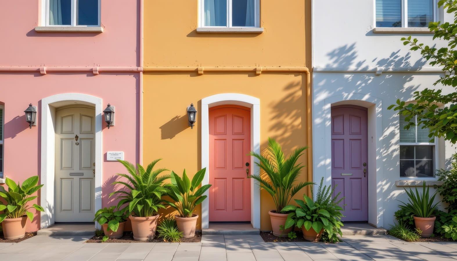
- Architectural harmony for exteriors: For exterior painting, consider your home’s architectural style, the colours of neighbouring properties, and how the chosen hue will interact with existing materials such as brick, roofing, and landscaping. Greige and warm neutrals tend to be the safest foundation, while dramatic darks and botanical greens are bold but highly rewarding choices.
- Mood and atmosphere: Think about the emotional experience you want a room to deliver. Rich mahogany and deep plum create drama and intimacy. Olive greens and botanical tones bring calm and connection to nature. Dusty pinks and warm creams evoke comfort and softness. Let the purpose of the space guide your choice.
- Consider a colour-drench approach: One of 2026’s most exciting interior trends is the ‘colour drenching’ technique — painting walls, ceilings, and trim in the same tone for a deeply immersive, sophisticated effect. This approach is particularly powerful with earthy greens and warm mahogany tones.
- Regulations and body corporate requirements: If your property falls within a strata scheme, heritage overlay, or community that maintains consistent streetscape guidelines, always check relevant restrictions before choosing an exterior colour.
Conclusion
2026’s house painting trends mark a meaningful shift towards warmth, authenticity, and a deeper connection with the natural world. Whether you are drawn to the timeless appeal of warm greige neutrals, the resurgent energy of rich botanical greens, the boldness of deep mahogany and plum interiors, or the drama of a moody dark exterior, this year’s palette has something genuinely compelling for every home and every homeowner.
The key, as always, is to choose what works best for your home’s interior and exterior areas rather than simply following trends for their own sake. A fresh coat of paint is one of the most cost-effective ways to transform a property — but only when the colour is chosen with care, expertise, and a clear understanding of the space it is being applied to.
At Priority One Coatings, our experienced team is here to help you navigate these choices with confidence. From colour consultations and sample testing through to flawless execution by our fully accredited painters, we bring your colour vision to life with precision and care. Ready to give your home its 2026 refresh? Get in touch with Priority One Coatings today, and let’s create something beautiful together.